
That Election Map
UPDATE: Big, huge, whopping correction below regarding maps and projections. Sorry for the haste.
______
A while back I posted a map of the 2008 presidential election results: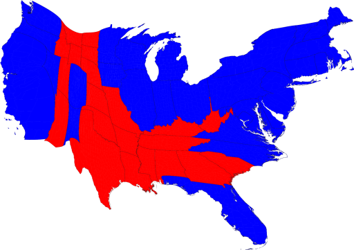
That's the Newman map, a cartogram which projects the national vote based on state population, i.e. electoral votes, and not on state size, i.e. area.
While checking into a recent (and unrelated) post, I unearthed this nugget:
That's from Rush Limbaugh's site. To be sure, the latter map casts a decidedly different picture of the American electorate, county by county. It's enough to make one wonder whether Newman and Limbaugh were looking at the same country on the eve of the '08 election. But Newman accounted for this:
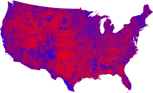
The areas of red and blue on the cartogram are now proportional to the actual numbers of electoral votes won by each candidate. Thus this map shows at a glance both which states went to which candidate and which candidate won more electoral college votes – something that you cannot tell easily from the normal election-night red and blue map.
But we can go further. We can do the same thing also with the county-level election results and the images are even more striking. Here is a map of US counties, again colored red and blue to indicate Republican and Democratic majorities respectively:
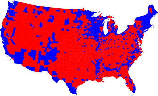
Now the effects we saw at the state level are even more pronounced: the red areas appear overwhelmingly in the majority, an appearance again at odds with the actual results of the election. Again, we can make a more helpful representation by using a cartogram. Here is what the cartogram looks like for the county-level election returns:
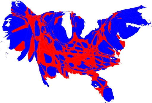
Okay, me again. Pretty striking. The cartogram clearly offers us a new way to look at elections, much in the way the
And the resulting cartogram?
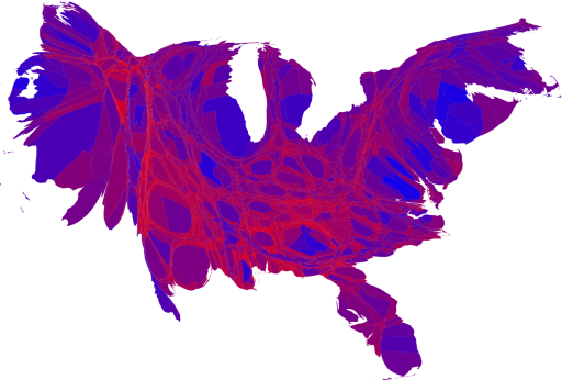
Less red than ever. And pretty much no matter how you slice it, a clear majority of the country trended Democratic in the last election: 375 to 173.
![]()


|