The Newman Map
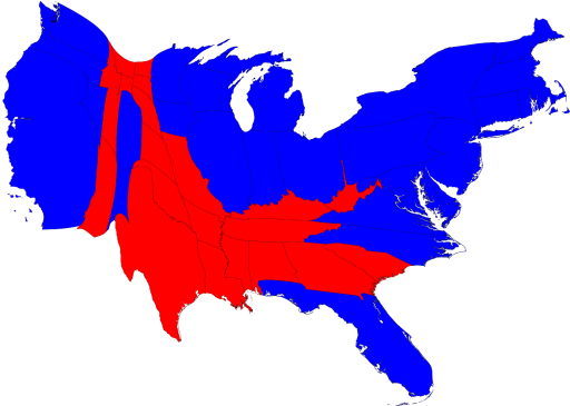
For those of you, like me, who are lost without all the eye candy that the pre-election electoral maps represented, take heart. There's still plenty of colorful representation to go around. Mark Newman shows us what the red and blue map looks like when we account for state populations as opposed to land mass. 
Not bad, eh? Makes me want to ask Jon Meacham if we're really and truly a center-right nation. Much more eye candy at the source. Thanks, Cody, for the link.


|